In recent times, you may have noticed that business organisations have been making deliberate efforts towards becoming more Consumer Centric. The business leads reckon the fact that Consumer Centric products sell better. Our client, an online video streaming service provider, was also embarking on the journey to become even more Consumer Centric.
Their target audience were the tech savvy youth, preferably married with at least one kid, residents of Tier-1 cities of Philippines and India. The client’s objective was to understand streaming video consumption preferences and gather quick usage feedback on their video streaming product.
At the start of the project, Qualitative research methods such as, in-depth Interviews and Focus groups were conducted. Moving forward in the software product development, there was a need to embed detailed User feedback collection in client’s Agile software development process. Logistics wise, the client wanted to be as lean as possible because travel to target countries usually increases turnaround time and cost.
After analysing the requirements, our UX consultants suggested to conduct online user testing using UXArmy remote user testing tools.
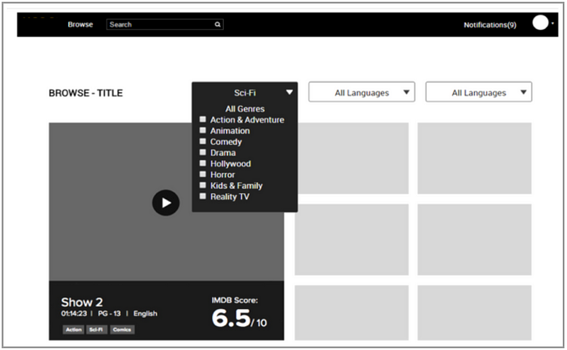
Example Low-Fidelity Prototype for Website
In the beginning stages of the project, the client wanted to test a clickable prototype, where test participants can interact with the user interface. The interaction design of user journeys for important task scenarios was to be validated, for instance, finding an episode, saving a movie to watch it later, rating a movie, filtering and subscribing to a plan.
In discussion with stakeholders at the client side, it was decided to proceed with 8 key tasks and a few open-ended questions for the online User test. We suggested 30 participants to take part in the User test.
We used UXArmy User Advocates Panel for the recruitment of participants. The client could specify the necessary psychographics criteria, and the panel would only select those participants that meet the criteria. To further make sure that the participants were representative of the client’s target audience, we created a screening questionnaire, that was presented to the participants before the tasks. The participants who did not fulfil the screening criteria, were not allowed to proceed with the test.
Our remote user testing tools guide the client through a step-by-step wizard to create the test. The client starts off by deciding the start and end dates of the test, and specifying the demographics criteria for participants, for instance age group, device type, location and gender. The client could then create the usability tasks and questionnaire for the test.
The result
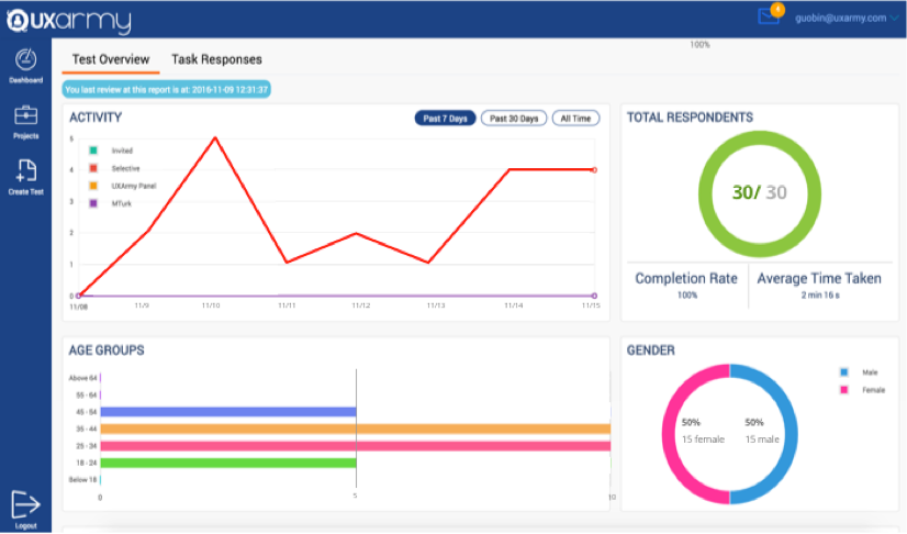
Test Overview page of the Report shows a quick overview of the progress and participants’ data, like age group, gender.
As the test was proceeding, the client could view the progress online in the tooling by logging into their UXArmy account. This online report provides an an overview of the demographics of the test participants and allows the client to keep track of Status of the User Test.
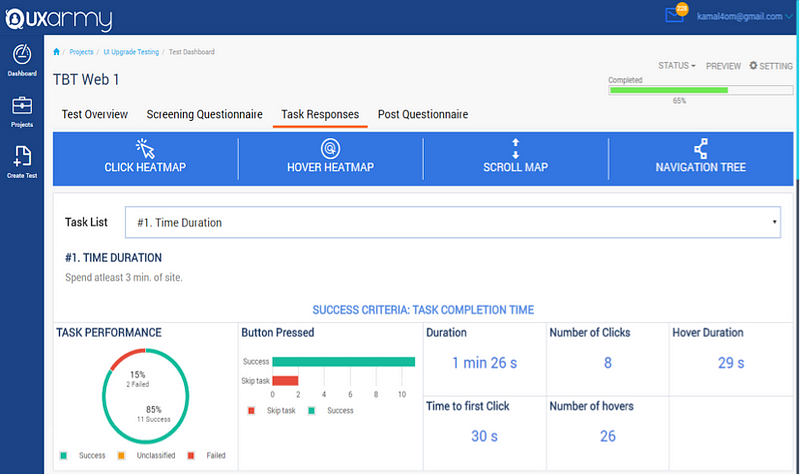
Task Responses Report shows data, such as Task success rate, Heat maps, time taken to complete task, video playback and more, on how did the participants completed each of the Tasks.
In a separate tab, the client could see the Task responses report. This is where the client could have a broader view of the overall trend on how the participants did the tasks, and then do a deeper analysis to see how a specific participant did each task. The report is useful in identifying the tasks that had most success or low completion rates. This allowed the client to prioritize which issues to resolve first.
The client can further pinpoint the reasons why the participants were not able to complete the task with the help of heat map, click map and navigation tree. For instance, if the heatmap doesn’t have clicks on the desired page element it would mean that the Design might not have been clear to the Users.
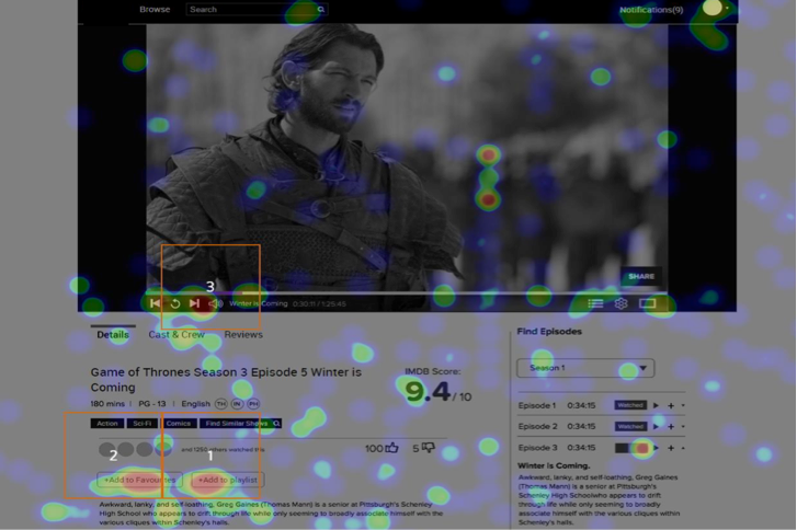
Click Heat Map shows where the participant clicked and how many times did he/she clicked at an element. Red means the highest intensity of clicks and blue is the lowest intensity of clicks.
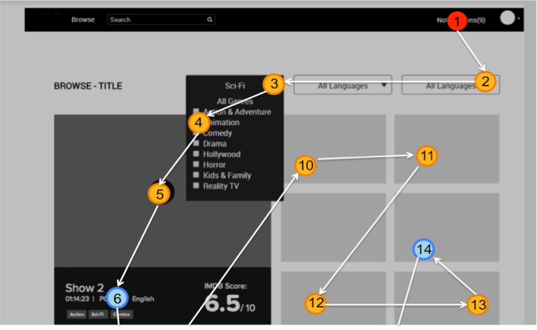
Click map shows the flow of the navigation made by the participants in a particular page and where the users get stuck in the page. Orange circles are used to indicate a mouse CLICK made and blue circles are used to indicate a mouse HOVER.
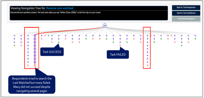
Navigation Tree shows how the participants navigate through the website as they do the task and the steps taken.
With all the data and insight gathered, the client was able to iterate on its UX Strategy and Design. The client planned to launch the product on their Smartphone App. We advised them to conduct another online usability test for Apps, as an App usage is different from a Website usage.
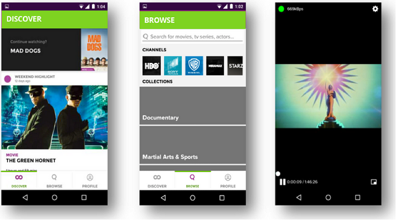
Medium-fidelity prototype for Smartphone App
After two rounds of User tests and product improvements, the client’s Mobile App was ready to be launched. The test participants of the new App had expressed high level of satisfaction with Usage. They used words like “Awesome”, “Enjoyable”, “Great” and “User-friendly” when they were asked to describe the App’s look and feel.
Conclusion
Remote User testing is a great method to gather quick and cost effective user feedback. Even if unmoderated, it complements the Qualitative UX research result, which is usually moderated. Our UXArmy remote user testing platform is capable of recruiting the right participants in a short time and gather unbiased quantitative and qualitative data that can otherwise be missed.
User testing can be done at any stage of the development. And it is against conventional beliefs that more user testing leads to higher development cost. By conducting user testing frequently, you will know your users soon and better. As a result, you will develop things that your Users love and advocate.
If you like to have a free demo of our remote user testing tools, do sign up at our UXArmy website.